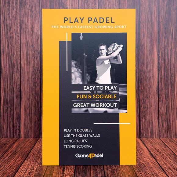
Strut cards are one of the most effective tools for visual marketing. Whether displayed on shop counters, reception desks, or at events, these small yet powerful pieces of print make a big impact. When designed well, strut cards catch the eye, deliver important messages quickly, and influence customer decisions.
In this blog, we’ll explore how to design effective strut cards using simple visual techniques. We’ll also discuss key design elements such as typography, colour, layout, and material choices. Whether you’re creating your first strut card or looking to improve an existing design, these tips will help you achieve great results.
What Are Strut Cards and Why Do They Work?
Strut cards are printed signs with a folding strut at the back, allowing them to stand upright on flat surfaces. They are often used to promote offers, new products, or important messages. Because they are lightweight and easy to move, businesses use them in many settings – from retail shops and salons to restaurants and waiting areas.
What makes strut cards effective is their ability to grab attention at eye level. Unlike posters or banners that might be missed, strut cards are placed where people naturally look. Their size and design make them ideal for short, powerful messages.
Strut cards are also budget-friendly. They offer a professional way to advertise without the high cost of digital displays. When combined with quality strut card printing, they create a lasting impression and help businesses communicate more clearly.

The Visual Hierarchy: Guiding the Viewer’s Eye
One of the most important parts of strut card design is the layout. A clear visual structure helps guide the viewer’s eye to the most important information. This is called visual hierarchy.
You can create a strong visual hierarchy by following these simple tips:
- Headline at the top: Make it bold and large to grab attention first.
- Supporting text in the middle: Keep it short and easy to read.
- Call to action (CTA) at the bottom: Tell the viewer what to do next, such as “Buy Now” or “Book Today”.
Designs often follow an F-shaped or Z-shaped reading pattern, meaning people look from left to right and then down. Make sure your message flows in that direction to keep it easy to follow.
Typography That Talks
Fonts have a big impact on how people understand your message. Use clear, readable fonts that match your brand’s personality. For example, a beauty salon might choose a modern and elegant font, while a toy shop might go for something more playful.
Here are a few basic rules for typography in strut cards:
- Use a maximum of two or three font styles.
- Keep headlines large and bold.
- Avoid highly decorated fonts that are difficult to read.
- Ensure there is enough space between lines.
Remember, people often view strut cards from a short distance, so your text must be clear and readable.
Colour Schemes That Speak Volumes
Colour is not just about making your design look good – it also creates emotion. Different colours trigger different reactions. For example:
- Red can show urgency or energy.
- Blue builds trust and calmness.
- Green is often linked to nature and health.
- Yellow grabs attention and feels cheerful.
Stick to your brand colours to stay consistent, but feel free to use contrasting tones to highlight certain parts, such as your CTA. If your main brand colour is blue, using orange or white for the CTA can help it stand out.
Also, make sure your colour combinations are easy on the eyes. Avoid light text on a light background or dark text on a dark background.
Image Placement and Use of Graphics
Images and graphics bring your strut card to life. A well-placed image can tell a story faster than words. Use high-resolution pictures that relate to your message. If you are advertising a product, show the product clearly and in use.
Avoid cluttering your design with too many graphics. Leave enough white space to keep the layout clean and professional.
Custom illustrations or icons can add a unique touch. They are especially useful for branding and making your card more memorable. Just make sure the images don’t distract from your main message.
Crafting Compelling Copy
Your text should be short, clear, and persuasive. People usually don’t read every word – they scan. So, your message needs to be simple and to the point.
Focus on the benefits, not just the features. Instead of saying, “New moisturising cream now available,” say, “Get softer skin in just 7 days!”
And don’t forget your call to action (CTA). Tell the customer what to do next – whether it’s “Visit Our Store,” “Order Today,” or “Call Now.” Place it in a bold font and make sure it stands out from the rest of the content.
The Finishing Touches: Print & Material Choices
The material you choose for your strut card can change the way it feels and performs. For a strong, long-lasting display, Foamex is a great choice. It’s a lightweight, rigid PVC board that holds its shape and supports vibrant printing.
Other popular materials include cardboard and corrugated board. You can also choose between different finishes:
- Matt for a soft, non-reflective look.
- Gloss for a shiny, high-impact feel.
- Laminated for extra protection and durability.
Don’t forget the strut at the back – it needs to be sturdy enough to hold the card upright. A strong strut will keep your display looking professional throughout its use.
Examples of Creative Strut Card Designs
Here are a few examples of how businesses use creative designs to stand out:
- Restaurants: Strut cards showing new menu items or daily specials, with mouth-watering images and bold pricing.
- Real estate agencies: Cards shaped like houses with key selling points listed clearly.
- Retail shops: Seasonal promotions using bright colours and festive designs.
Adding a unique shape or cut can also make your strut card more eye-catching. Just make sure the design still fits the space where it will be displayed.

Common Design Mistakes to Avoid
Even the best ideas can fall flat if certain design basics are ignored. Here are some mistakes to watch out for:
- Using low-quality images that appear pixelated or blurry.
- Adding too much text, making it hard to read.
- Choosing fonts that are too small or decorative.
- Failing to include a clear call to action.
- Using flimsy materials that don’t last.
A clean, simple design will often perform better than a cluttered one. Always think about what your audience needs to see and what action you want them to take.
Conclusion
Strut cards are a powerful way to promote offers, share messages, and grab attention – all while being cost-effective and easy to display. By focusing on strong visuals, clear messaging, and quality materials like Foamex, your strut card can make a lasting impression.
Whether you’re advertising a special promotion, new product, or simply want to boost your brand presence, the right design makes all the difference.
If you’re looking for reliable strut card printing and expert design support, Board Printing Company offers tailored solutions to suit your business needs.


